Rendr
❋ Creative Direction, Design, Digital, Visual Merchandising
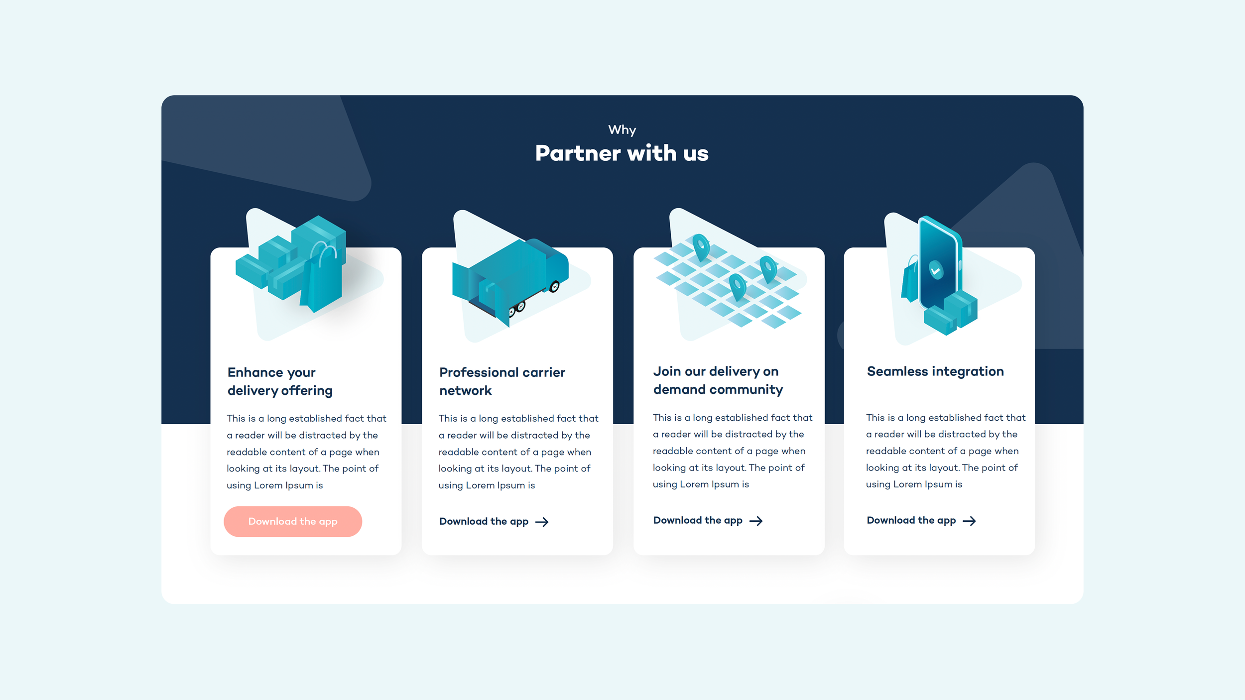
Rendr is a delivery-tech platform that automates and optimises delivery operations with retail stores.
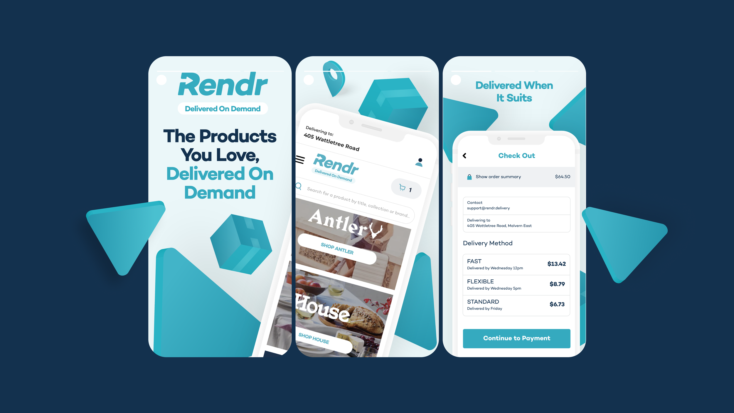
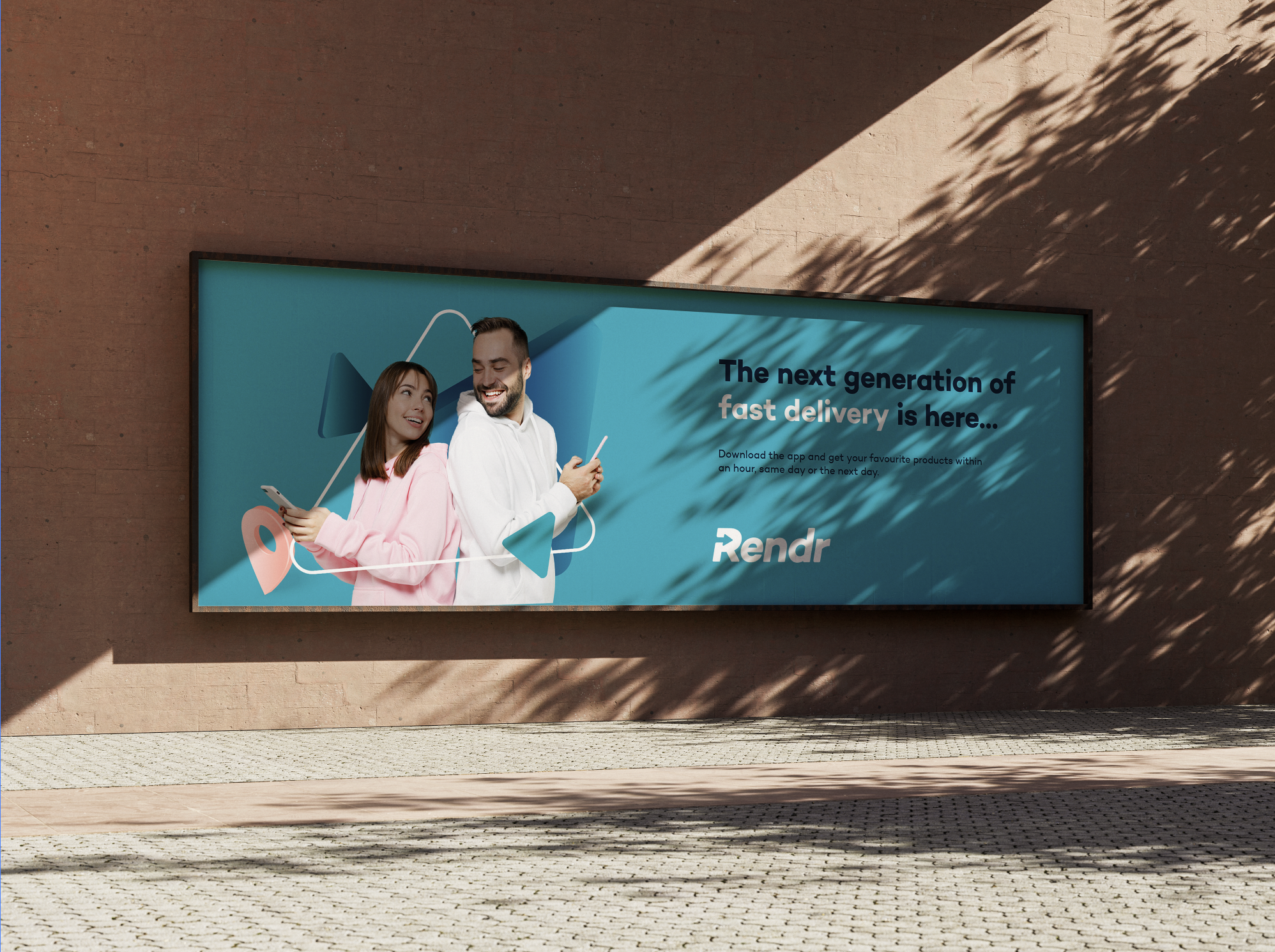
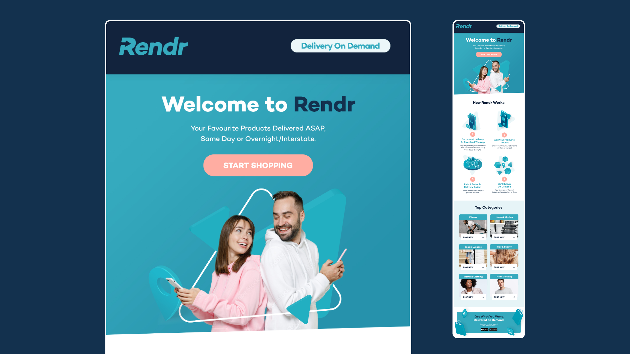
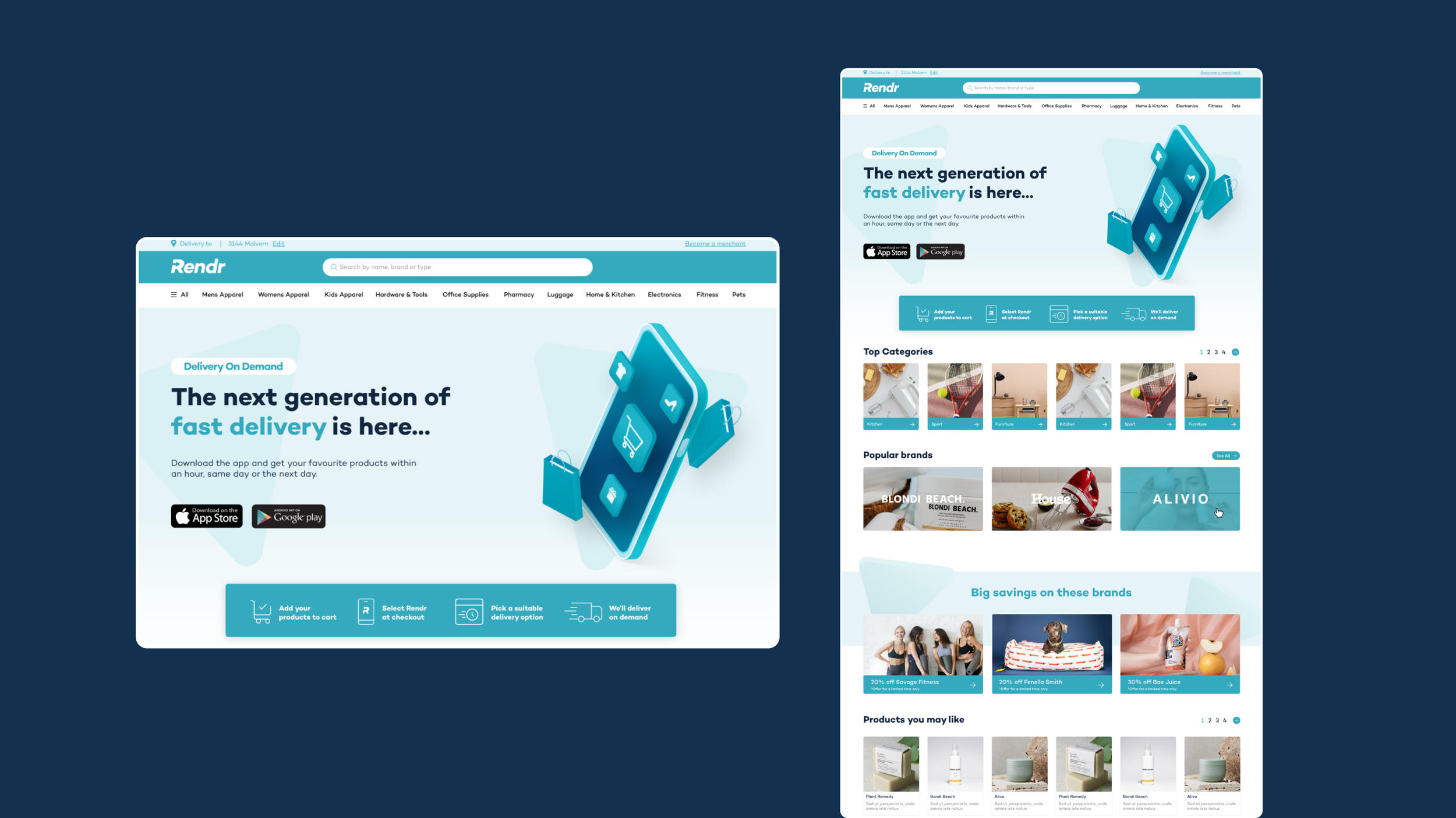
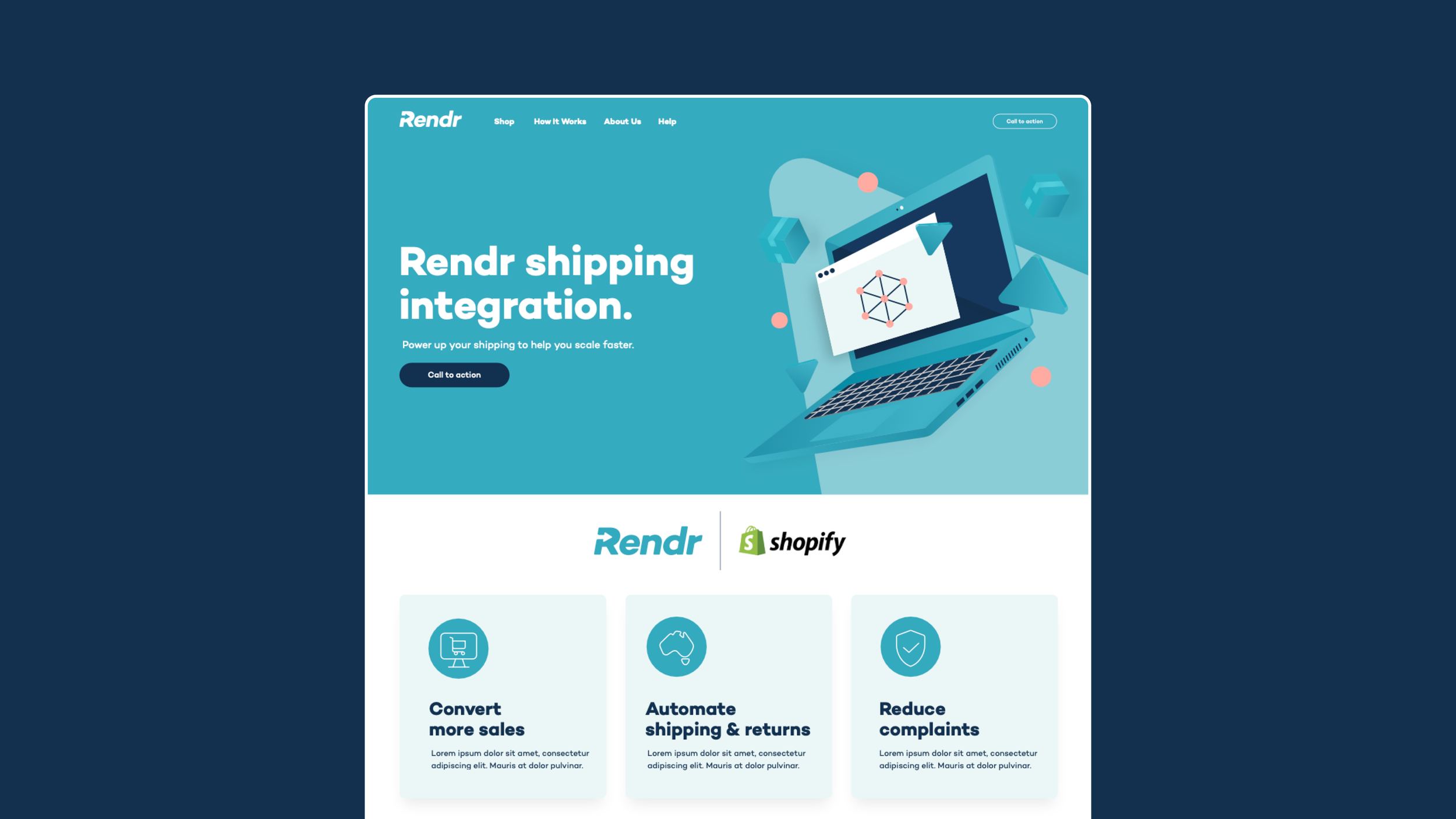
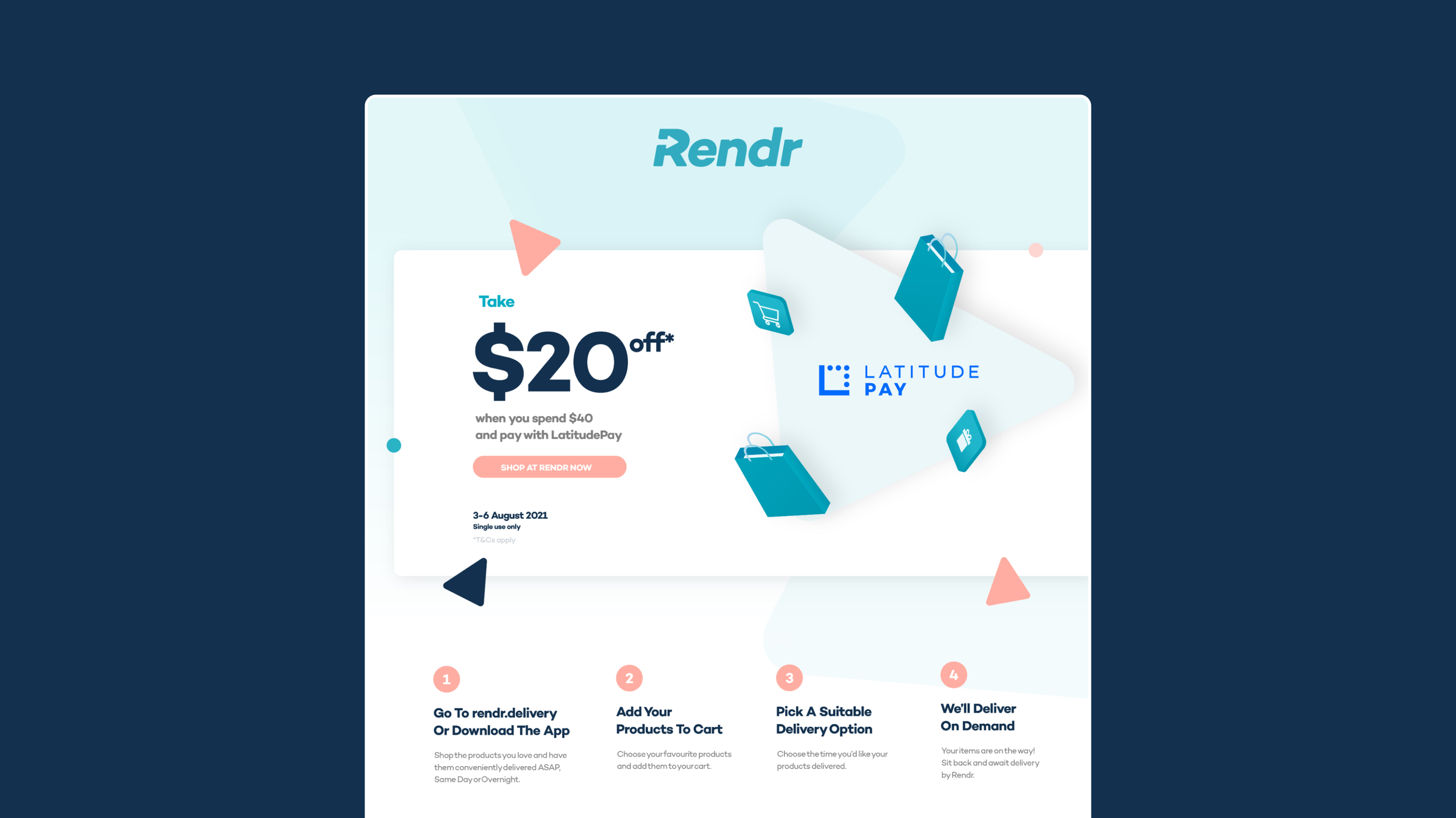
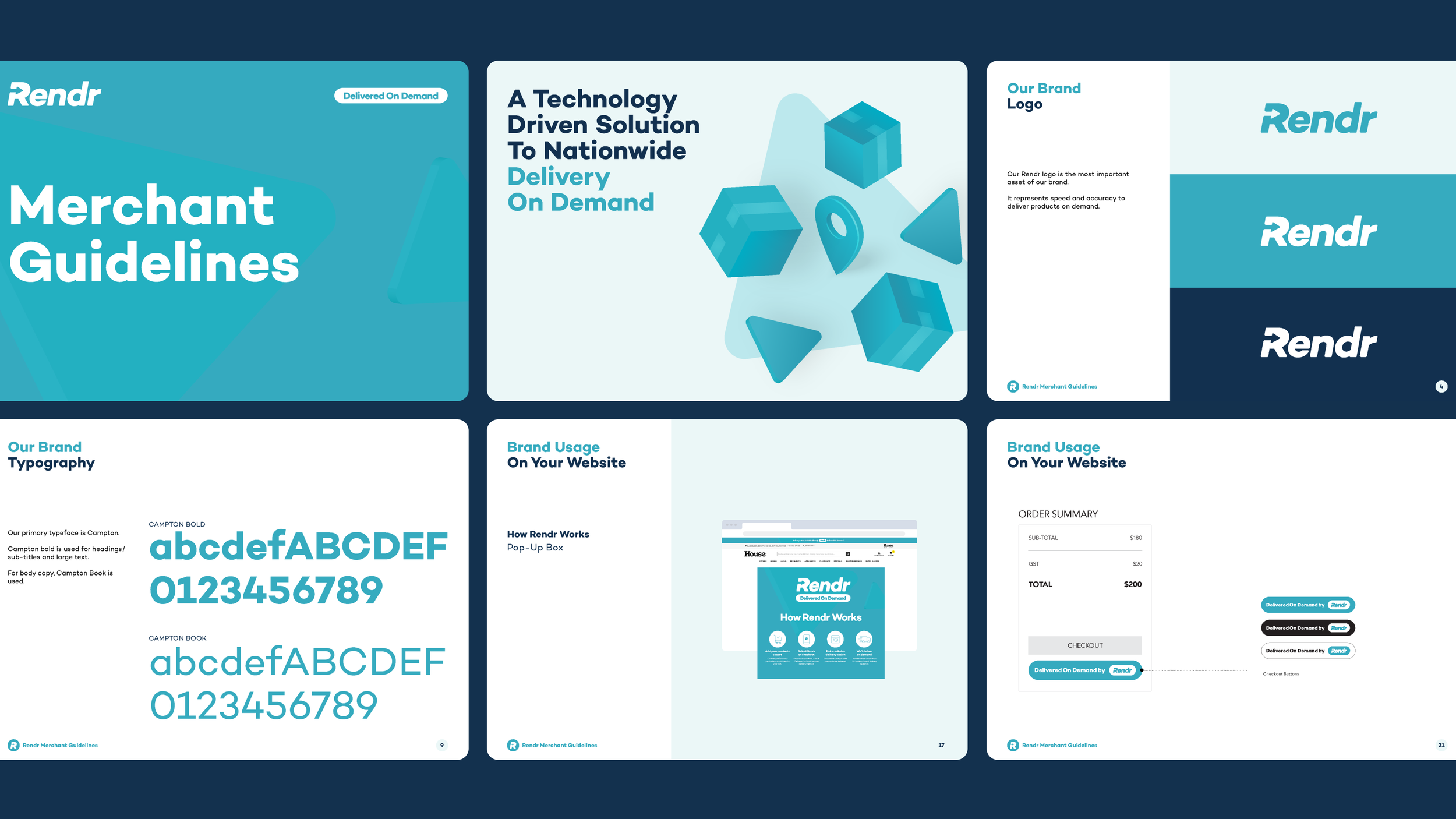
I was tasked in giving the brand an evolution, through concise creative direction and design, across social assets, emails, website, in-store collateral and brand guidelines.

The arrow
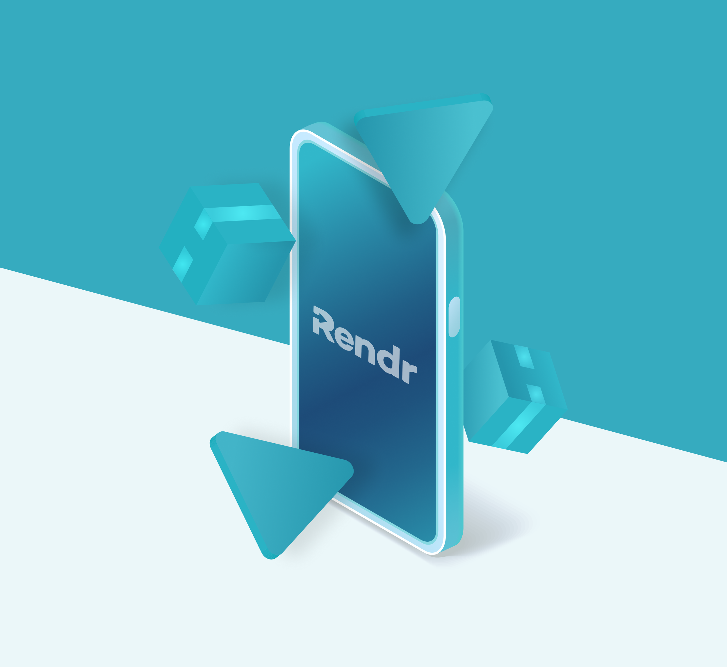
At the heart of the refreshed identity is the arrow—a distinctive element carried forward from the existing logo and reimagined as a core brand device. By extending the arrow across the visual system, the brand retains a strong connection to its heritage while creating a more cohesive and recognisable experience.
The arrow naturally embodies the essence of delivery: movement, direction, speed and progress. It serves as a visual cue that guides users through the brand experience, reinforcing the idea of items moving seamlessly from point A to point B. Whether used within layouts, graphics or digital touchpoints, the arrow creates a sense of momentum and efficiency, reflecting the fast, reliable service at the heart of the platform.
More than a graphic element, the arrow becomes a symbol of connection—linking customers, drivers and destinations through a simple yet powerful visual language that communicates confidence, clarity and forward motion.